Rumera case · Complete Package

Nuvi Beauty: 10 days to a store ready to sell.

Nuvi came in with a good-looking Shopify store, great photos and a single price: everything for R$ 30. What the store didn't do was say why to buy there. This is the story of the 10 days of work, from the first screenshot to delivery.
ClientNuvi Beauty, curated makeup, Brazil
PlatformShopify, mobile first
PackageComplete: Brand + Conversion
Timeline10 business days, 2 meetings
Nuvi Beauty
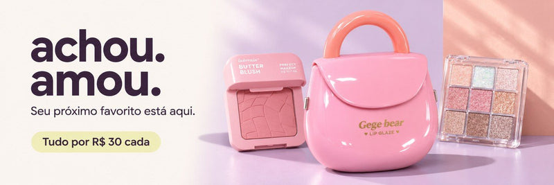
New Nuvi Beauty homepage on desktop, with the line achou, amou and everything for R$ 30
BeforePrep

The starting point.

Before day one, Nuvi filled in the brief and shared access. Rumera did a first read of the store: beautiful, but confusing. Three offers rotated in a 12 px banner, the promise was "Korean-aesthetic makeup" and a rainbow logo competed with the products for attention.

BriefShopify accessFirst store reviewBaseline numbers
Old Nuvi homepage on desktop
Before, on desktop. A pretty banner that didn't say what the store is or what it costs.
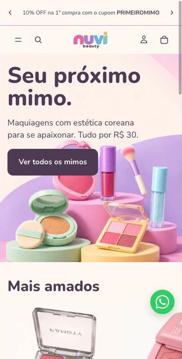
Old Nuvi homepage on mobile
Before, on mobile. Where most visits happen.
Day 1Kickoff and tracking

Measure first. Change later.

Nothing was changed on the live store. Rumera made a copy of the theme, captured the before of every screen and checked that data was coming in. Without that, no improvement could be proven later.

Theme copyBefore screenshotsAnalytics verifiedClarity installedSearch Console
1theme copy to work without pausing the store
2mobile widths tested on every screen: 360 and 390 px
23product photos with no description for Google and screen readers
3data tools verified: Analytics, Clarity and Search Console
Days 2–3Diagnosis

18 issues were blocking sales.

The store was reviewed page by page through three lenses: a first-time shopper, a returning customer and accessibility. Each issue got a severity score.

18issues found
Catastrophic1
Major5
Minor9
Cosmetic3
Old side cart with the WhatsApp button covering the checkout button1
Side cart. The WhatsApp button sat on top of the checkout button.
Old product page with a sticky bar showing only an icon2
Product page. The sticky buy bar showed only an icon, no label.
Old cart with no free shipping progress3
Cart. No hint of how far you were from free shipping or the bundle.
Old FAQ with WhatsApp covering the text4
FAQ. WhatsApp covered the answers.
Old categories on mobile5
Categories. Just an image and a tiny label to choose from.
The finding that changed the project

The banner promised free shipping. Checkout charged R$ 10.

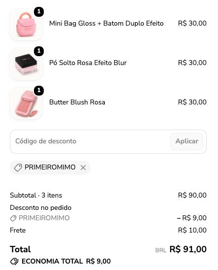
In the test purchase, 3 items at R$ 30 with the 10% first-order coupon came to R$ 81. Shopify's rule only gave free shipping from R$ 90. Anyone who trusted the banner paid R$ 10 shipping at the very last step.

Fix: the rule stayed, the promise changed to "free shipping from R$ 90", on every page.
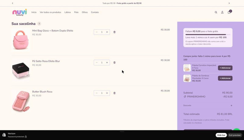
Test purchase cart with 3 items and coupon, total R$ 81
Test purchase checkout charging R$ 10 shipping
◷
Meeting 1 · Plan approvedNuvi received the 18 issues ranked by impact and approved the brand direction.
Days 4–5A refreshed brand

From a borrowed style to a point of view of its own.

Nuvi didn't need to look Korean. It needed to be the place to find your next favorite, at one price. The new brand was approved by message and applied to the theme.

BeforeOld Nuvi logo in rainbow letters
AfterNew Nuvi logo with symbol and dark letters
Before"Korean-aesthetic makeup", "treats" as a product name and prices the size of body text.
AfterCurated finds, local and imported, R$ 30 each. The price is always the strongest number on screen.
BlackberryText and action
LavenderTrust
CitronPrice and highlight
PeachWarmth and gifting
ChalkBackground
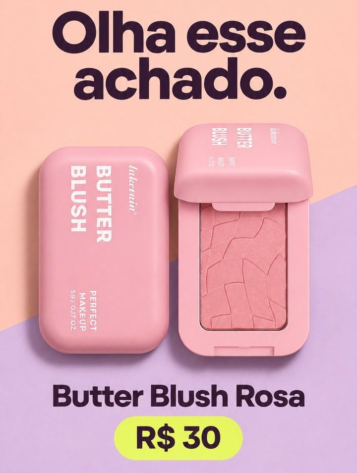
Nuvi products with the new identityNuvi editorial piece with the line achou, amou
Days 6–8A store that sells

Every screen answers a shopper's question.

With the brand in place, the store was rebuilt on three fronts: the storefront, which makes people stop; the decision, which clears doubts; and the checkout flow, which carries the order to the end. Store screens stay in Portuguese, as the customers see them.

StorefrontWhat it is, what it costs and why to trust it.
New Nuvi homepage on mobile
Homepage. Single price up top and the bundle explained.
Why Nuvi block with numbers
Why Nuvi. Reasons turned into numbers: R$ 30, R$ 100, 7 days, R$ 90.
Find of the day carousel
Find of the day. Swipe sideways and buy in one tap.
Decision and checkout flowFewer doubts, more orders.
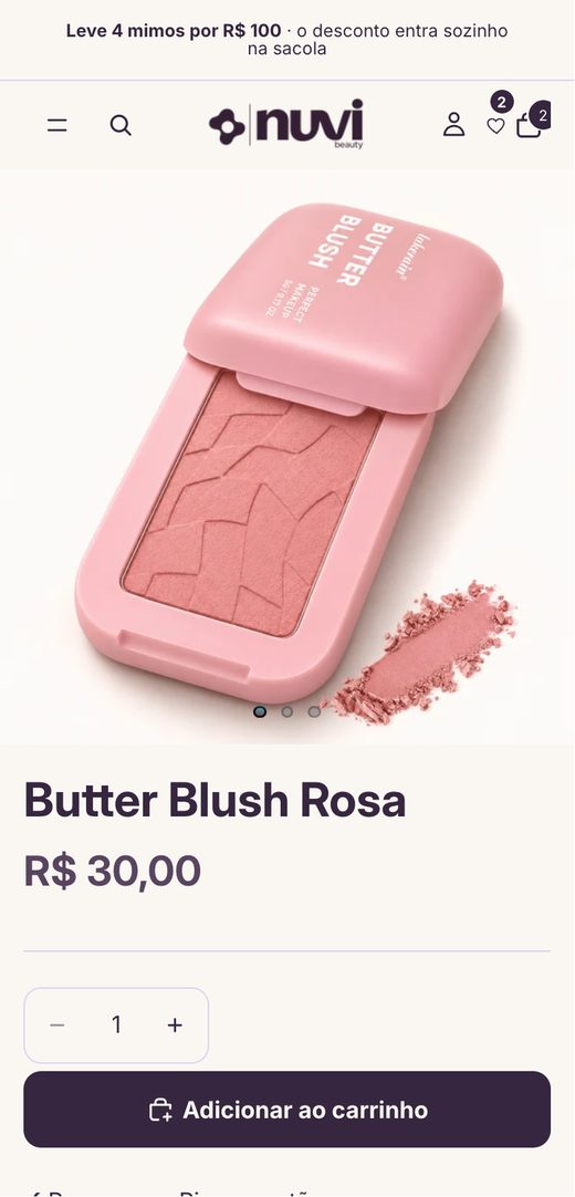
New product page
Product page. One clear button and no-nonsense info.
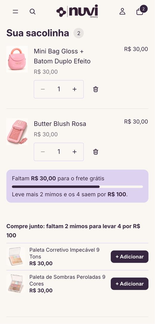
New cart with free shipping progress bar
Cart. Free shipping bar, bundle math and one-tap suggestions.
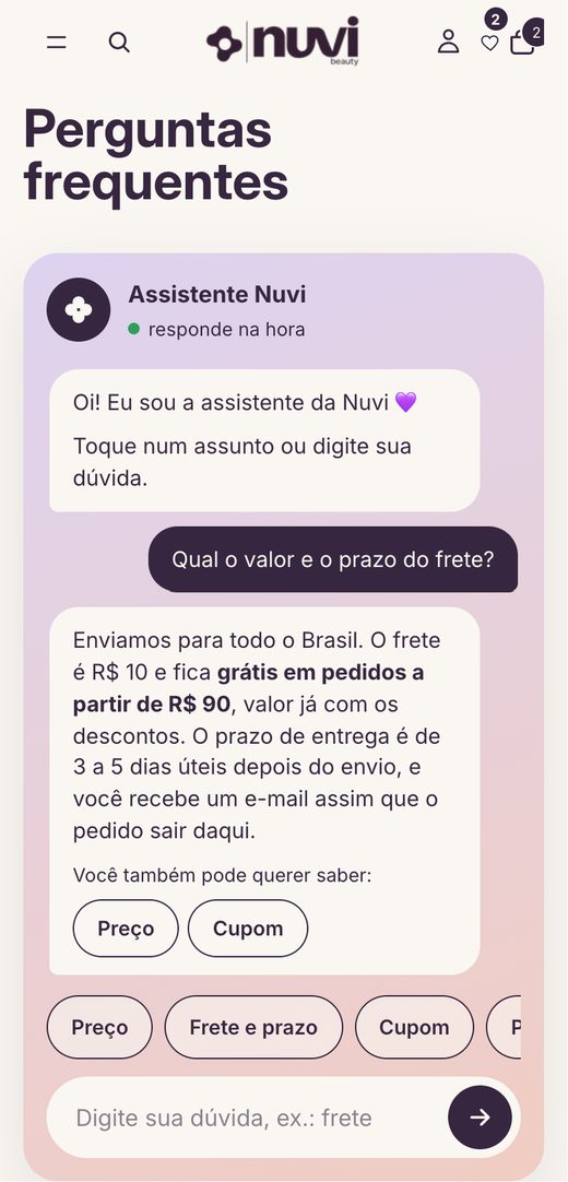
Nuvi FAQ assistant
FAQ. An assistant built on the store's own answers, with a WhatsApp fallback.
Before and after

Drag to compare.

Price and offer moved to the top, with the benefits strip right below.
Before: homepageAfter: homepageBeforeAfter
Day 9Quality and launch

Tested before going live.

Before launch, the store went through a full end-to-end purchase, testing on small phones and an SEO review. Only then was the new theme published, with Nuvi's OK.

Full test purchase360 and 390 px screens44 px buttonsDescribed photosTitles and descriptions for GoogleTheme published
Day 10Delivery

Ready to open means ready to measure.

At delivery, Nuvi got the before and after, the report and the 30-day plan. Every change shipped with the metric that should go up and the guardrail that can't go down.

ChangeShould go upCan't go downPriority
Benefits and bundle on the homepageItems per orderHomepage conversion7.7
Free shipping bar in the cartOrders with 3+ itemsSession conversion7.0
"Coupon and bundle don't stack" noticeCart to checkout with 4+ itemsCoupon questions on WhatsApp7.0
Reviews below the priceAdd to cart on product pageReturn rate6.7

What we chose not to do, and why:

A/B tests before launchNo traffic means no reliable result. Changes were dated to compare later.
An AI chatbotRule-based answers can't invent a return policy.
A "best seller" badgeOnly once there are real sales. Reviews are never paid for.
Touching checkoutThe store's plan doesn't allow it, so the offer moved to the cart.
◷
Meeting 2 · Delivery and trainingBefore and after, report and training: how to read Analytics and Clarity and what to test first.
30 days later

The next chapter.

The store opens in December. With data in place from the first order, the 30-day read lands here, with before and after in numbers.

  • Items per ordermeasuring
  • Orders with 3+ itemsmeasuring
  • Session conversionmeasuring
Your turn

Want this path for your store?

Same 10 days, same 2 meetings. Start with the Diagnosis or go straight for the Complete Package.